UX projects
-

Minideli's app
Minideli is a new brand of coffee & desserts that seek to arrive at the heart of all online consumers by launching a mobile app to take all the orders.
-

Cimbra responsive web site
A Mexican food consultant who seeks to improve all Mexican food processes by offering their services through a responsive web page.
Cimbra’s responsive web project overview
A web space where all the alimentary professionals could find valuable information to increase their knowledge in the field and access to professional services related.
Cimbra’s responsive web page
A web space where all the alimentary professionals could find valuable information to increase their knowledge in the field and access to professional services related.
Project duration:
1 march 2022 – 17 may 2022
The problem:
In Monterrey, there doesn’t exist an online service of alimentary consultants that you could schedule from the web page.
The goal:
Increase the online leads to convert to new clients.
Provide high-quality content in order to increase customer loyalty
My role:
UX & UI designer
Responsibilities:
User research | Wireframing | Visual design | Prototyping | User design
Understanding the user
User research | Personas | Problem statements | User Journey maps
User research summary
The research of this project was primary and secondary throw the investigation and interviews, at the beginning I had the assumption Bias of all the business owners are actualized in the field of food innovation. In addition, I have the assumption of that the owners aren’t interested in the sanitary regulations.
User pain points
Find formal information related to food industry
There aren’t´in the web information related to innovation in the food industry.
Understand the process of food innovation
Is difficult to understand how to get help in the innovation process in food industry.
Talk to an expert in food innovation
Is difficult to find experts to talk and expose doubts without charge.
Sckedule an apointment
Take too many steps to a professional in food industry to reach an appointment with a professional.
Persona
Problem statement
Alejandro Gaona is a new graduate who needs to place a large order of quality coffee for his morning meeting that arrives correctly and on time.
Alejandro Gaona
Happy boss photo created by benzoix - www.freepik.com
Age: 73
Education: Profesor
Hometown: Chicago
Family: Married
Occupation: Tacotitlan owner
“In order to get my professional challenges, I need everything to be quality, fast and accessible, especially the food”
Goals
Grow up his taco business
Open restaurants en México
Have the best quality standards
Frustrations
He is a busy person, so he needs that his providers are easy to find and schedule appointments.
He needs to read articles related to innovation in the food process from proven sources.
He needs to find the best services in one place.
Don Pepe is a 73 years old businessman who has more than 45 branches of his restaurants in the USA and has the idea to expand to Mexico, in this country, the sanitary regulations in the food process are quite different from the USA he wants to be actualized in this field and implement the more new process as possible, not only in the news branches in Mexico but in the actual branches in the USA, he es active, need everting synthetized an easy to understand and is looking for providers who make fast and excellent his work.
User journey map
To ensure that Alex and his team get their coffee orders on time and in a safe and easy way.
Starting the design
Paper wireframes | Digital wireframes | Low-fidelity prototype | Usability studies
Paper wireframes
Thinking about the best way to schedule an appointment
Digital wireframes
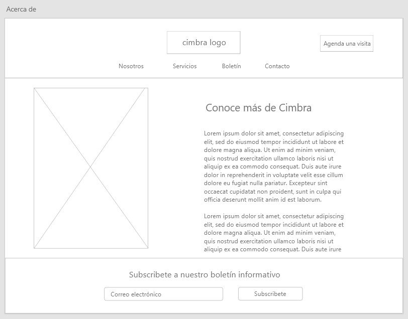
Clear and simple information arquitecture.
A visible button to quick schedule of appointment
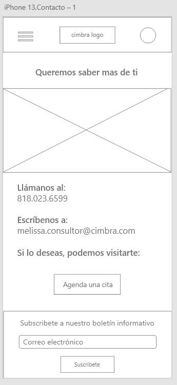
In mobile versión the menu is in the hamburger icon
Is important to have the subscription visible box in every section
Services in scroll
The newest bulletin is at the top to ensure visibility.
The oldest bulletins are at the bottom.
This window will show when you subscribe to the weekly bulletin.
Is important to show the contact info.
The most important in this site is the appointment tool, it was designed in 3 sctions.
Is important to ensure to have all the contact info in order to assist fisicly to the appointment.
Is important to have an easy way to access the appointment, and have the option to cancel or change the appointment.
Usability study
I have conducted a moderated usability study on 5 subjects, 3 of them women 2 men 1 of them with special abilities, the age range was 22-42 years old, the studie’s duration was 45 minutes.
Round 2 findings
Round 1 findings
Change the order in the newsletter area.
Repeat the subscription bar.
Add successful subscription banner.
Change the image to a complete image
Change the size of the calendar
Add a close button in the successful subscription banner
Refinig the design
Mockups | High-fidelity prototype
Mock ups
Desktop
Mobile
minideli’s app project overview
Minideli is a new coffee shop in Monterrey, for his value proposal they need a menu app to order deserts and coffee to be on time at the office of men and women from 18 to 45 who work in an office.
Minideli menu app
Minideli menu app to order deserts and coffee to be on time at the office of men and women from 18 to 45 who work in an office.
Project duration:
1 Dic 2021 – 1 feb 2022
The problem:
In monterrey there aren’t a online service of coffe and deserts delivery
The goal:
Increase the online sales of Minideli
Give to the way to schedule delivery of coffee and deserts.
My role:
UX & UI designer
Responsibilities:
User research | Wireframing | Visual design | Prototyping | User design
Understanding the user
User research | Personas | Problem statements | User Journey maps
User research summary
The research of this project was primary and secondary throw the investigation and interviews, at the beginning I had the assumption Bias of all women and men in offices buy coffee and order by phone or online, but the reality is that most of the deliveries online are made from women from 18 to 35 years, and mostly order food and coffee or beverages are optional.
User pain points
Messi orders an difficult
It is difficult to take large orders in the office, we must make the design contain the easy way to make a large order through team collaboration.
Proximity to the coffee shop
We don't always have a quality coffee shop nearby; we should include the option of in-store pickup or shipping that is close to the user's area by geolocation.
Payment
The payment method is a problem, we should include payment by credit card, by the most known payment gateways as well as cash on delivery, handle special discount for electronic payments
Delivery on time
It is important to deliver at the agreed time and that the product arrives correctly and at the desired temperature.
Persona
Problem statement
Alejandro Gaona is a new graduate who needs to place a large order of quality coffee for his morning meeting that arrives correctly and on time.
Alejandro Gaona
Happy boss photo created by benzoix - www.freepik.com
Age: 23
Education: Marketing
Hometown: Chicago
Family: Single
Occupation: Marketing Analyst
“In order to get my professional challenges, I need everything to be quality, fast and accessible, especially the food”
Goals
Grow up in his career.
Make an MBA.
Been Manager al 25 five years.
Work in an international brand.
Frustrations
He has time on his hands but needs a quick, tasty, and affordable drink to start his day.
He does not have a coffee shop on his way to work.
He has to stand over the other 10 peers
He has the responsibility to arrange the morning meeting plus his regular activities
Alejandro is a 23-year-old young man who is just starting his career, he usually works overtime to learn as much as possible and to make merits to climb as fast as possible, he is thinking of studying for a master's degree and likes to help his bosses in extra tasks, he likes to do courses and diplomas but above all that his work is impeccable, he has very good customer service and is very cheerful but very preoccupied. He has discovered that coffee time is a good time for networking.
User journey map
To ensure that Alex and his team get their coffee orders on time and in a safe and easy way.
Starting the design
Paper wireframes | Digital wireframes | Low-fidelity prototype | Usability studies
Paper wireframes
Thinking in the best way to take an order easy and fast
Digital wireframes
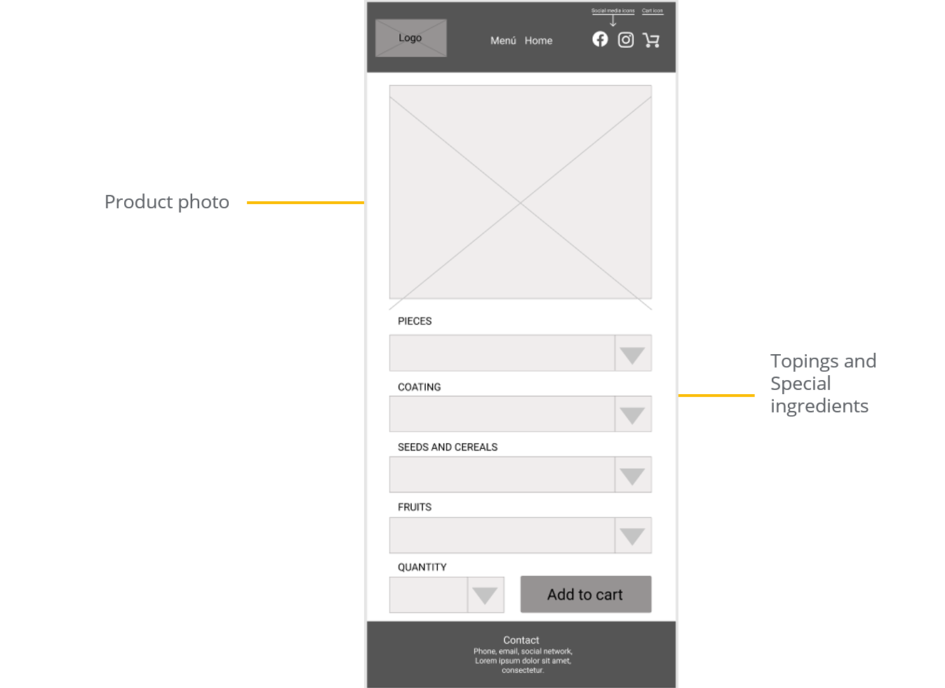
Find a way to show all the products and the explanation of them.
To make easy the navigation to do quick orders
The menu section has to be a visual and understanding section
The price has to be clear and the product to choose from.
Is important to us that our clients have clear what they are choosing.
The toping was ordered in an important way.
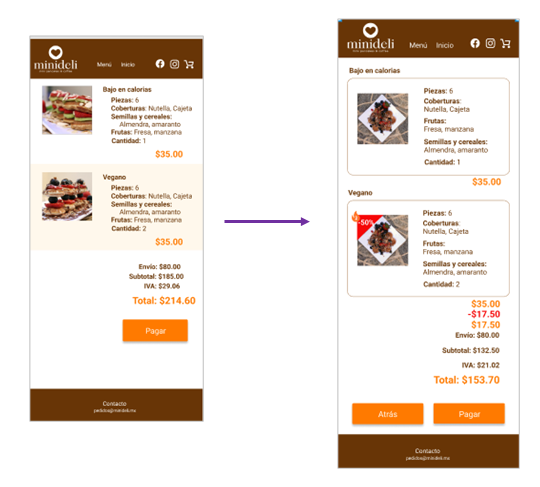
Important to have a clear specification of every charge
Is important to show how we apply discounts
Is important to be clear and offer security to our clients.
Is important to have a resume of the purchase.
it is important to let know the client that the purchase has been done successfully.
Usability study
I have conducted a moderated usability study on 5 subjects, 3 of them women 2 men 1 of them with special abilities, the age range was 22-42 years old, the studie’s duration was 45 minutes.
Round 2 findings
Round 1 findings
Differencing information by the kind of product.
Was missing the check-out step.
The back buttons were missing.
Animation was missing
The size of the buttons wasn’t the same
There was missing the button actions
Refinig the design
Mockups | High-fidelity prototype
I made real size and make the placement again because I didn’t use the grid.
I added a separator in order to agroup by proximity the products.
Make armony to the eye te fill of the fields.
Use to the space and blanks to improve te experience.
Use to the space and blanks to improve te experience.
Use to the space and blanks to improve te experience.


